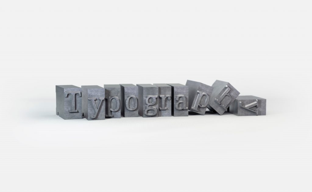
Have you ever thought about just how many fonts are out there? At our last count, it was 500,000 fonts (and growing)! If that sounds high, just think about how many different places you see fonts on a daily basis. They’re everywhere: in stores, on signs, online, on cars and license plates …. The opportunities are endless.
Fonts aren’t necessarily the most discussed topic when it comes to your branding and design, but they really can make or break your beauty brand. If you select fonts that your target customers find off-putting, you can actually drive business away.
But, use fonts well, and you can create a design that attracts interest and builds a loyal fanbase.
The key here is to use fonts that match your brand values, function, and desired aesthetic. Here’s everything you need to know to select the right fonts for your beauty brand.
The Five Types of Font
There are five core font types that are used most often, and they are:
- Serif: This is your classic font, like Times New Roman. Serif fonts are most often used for long pieces of copy because they’re inherently readable. Also, the letters in Serif fonts typically have little “feet” to distinguish them.
- Sans Serif: These fonts are sleeker-looking than Serif, with no “feet” on the letters—just straight vertical text with no stylization. Arial is a common example of a Sans Serif font, which are also often used for long copy.
- Slab: Slab fonts have an antique look, like American Typewriter. They should be used for emphasis only, and not for long passages, since they’re more highly stylized and harder to read.
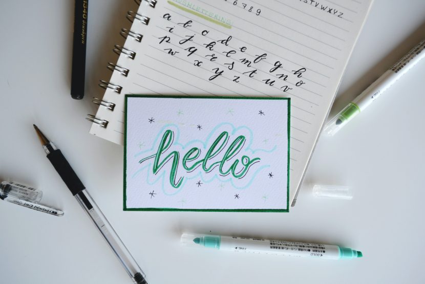
- Script: These are your fancy, elegant fonts that look like cursive handwriting. They should also be used for emphasis only, since they’re very hard to read across multiple lines of text.
- Decorative: Highly stylized and unique fonts; used for logos only, never for copy.
When choosing fonts for your beauty brand, you’ll probably want to start with three: one for your logo, one for your headers and subheads, and a main font for body copy. Slab, Script, and Decorative fonts are all great contenders for logos, since they make a dramatic statement.
What to Know About Fonts
1. Instant Response
It’s been shown that your customers will look at your copy or content and form judgments about it within milliseconds. What this means for you is that they’ll have an instant response to the typography of your beauty brand, whether they consciously realize it or not.
As you probably know from being a consumer yourself, there’s a lot of clutter on physical shelves and online spaces. Select fonts that cut through the visual “noise,” but also resonate with your target consumer before they even read what you’ve written or know the name of your brand.
2. Emotional Reaction
Another component to the instant reaction consumers have to typography is emotional. Certain types of fonts can generate feelings of trust, anger, romance, and so on. So, know the mood and emotional response you want to generate, and then look for a font to support that.
In his book Just My Type, Simon Garfield says that font “changes the emotion of what we say. We use it to express our individuality. If we all used the same thing, what a boring place we’d be in.”
3. Communicate Your Message
After the first few milliseconds, the best fonts will fade into the background. They’re like background music in a movie; you want them to add to the experience of your product, but not distract from it.
You want your font to be pleasant, but subconsciously so. The consumer should come away with a memory of the message itself, without being sidetracked by the font.
4. Readable
Of course, the whole purpose of putting written copy on your website, product, and packaging is to deliver a clear message. So you want to make sure your fonts aren’t tiring to the eye.
What this means for you and your brand is that you choose a font size that’s big enough to read comfortably (12 point font and up). Make sure your font color shows up strongly against the background, so that no one has to strain their eyes to make out your message.
5. Hierarchy
Yes, even fonts have a pecking order. The principle of typographic hierarchy is all about organizing your fonts to better communicate your message, and ensure that it’s readable.
Written copy and content should provide a clear path for your eye to follow. You want it to be very clear what’s most important on a page or package, then next most important, and so on. This path should ultimately lead to the message you want to send, and the action you want to take.
Be sure to break up your content, and separate your logo, heading, sub-heads, images, and body copy so that your customers don’t have to struggle to get your message.
6. Font Mashups
After you’ve decided how to rank your information in order of importance, it will be easy to determine which fonts belong where. As we mentioned above, your logos, headlines, and body copy will all be organized separately. Test out this arrangement to see which fonts are most readable in which places, without tiring the eye.
In order to keep everything cohesive, make sure the pair fonts that contrast each other, but without discord. You want fonts from the same family, but in different sizes or weights. In the end, what you’re aiming for is balance. Fonts that are too similar can make everything blend together, but fonts that are too different can look thrown together at random.
7. Font Sizing
A general rule in beauty brands is that small, minimal fonts are typically used for high-priced or luxury products. So, because you don’t want your brand to come across as cheap, avoid using large font.
This doesn’t mean that you shouldn’t play with font size, and test different options. Just be sure that, whatever font size you choose, it’s easy to read.
8. Word and Letter Spacing
Consider playing with font spacing in the same way that you play with size. Testing different amounts of space between the logo font and the copy font, for example, can help you decide what the eye prefers.
Test out more space or less space between the letters of your copy, or between words if your brand has two words in the name, and trust your eye. You’ll know when you’ve reached the right balance for your design and aesthetic.
The Final Product
You may very well have to play with lots of different font options and arrangements before you find the ones that feel most like your beauty brand. It’s a process, but it’s worth it. Customers tend to prefer products with cohesive, balanced packaging, and fonts are a big part of that visual experience.
Make sure you test out different options, and select the font that best represents your brand voice to your ideal customers.
Want to learn more?
For a start-to-finish look at how to build and grow your beauty business, check out our course, Learn How to Launch a Beauty Product. We cover every aspect of starting a beauty business, from creating a solid foundation and getting funding to manufacturing, branding, sales, and marketing. This guided approach keeps you on track and makes the process feel less overwhelming. To learn more about turning your product ideas into reality, sign up for our newsletters and read more about the course here.
One thought on “Why brand fonts matter, and how to use them for your beauty brand”